🔥 The New Web Highlights 🚀
Discover Web Highlights' new features: sidebar images, light/dark modes, editable titles, organized history/tags, and popovers. Share your feedback! 🚀
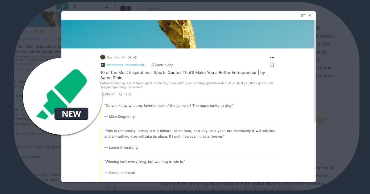
This update is just for you 💪 I have been working hard to bring this update to life. In this article, I'll walk you through all the changes and show you how to make the most of the new features.
Here is an overview of the key improvements:
- The sidebar now has a beautiful cover image 📷
- You can switch between light ☀️ and dark 🔦 mode.
- You can edit titles and descriptions 📝
- Your highlighted websites are neatly organized in a history list ⏱️
- You can open highlighted websites in a popover 📖
ℹ️ The latest update will be released gradually to users. If you don't have the newest version yet, please be patient.
I understand that change can be challenging, but I hope you'll come to love the new design as much as I do. Your feedback is invaluable to me, so please take a moment to fill out this form and help me enhance the app even more. I truly appreciate it!
Preview Image of Websites 📷
When you visit any website the new preview image will directly be noticed.
Showing the preview image of an article or any website makes the sidebar much more enjoyable and gives you a great feeling of the website.
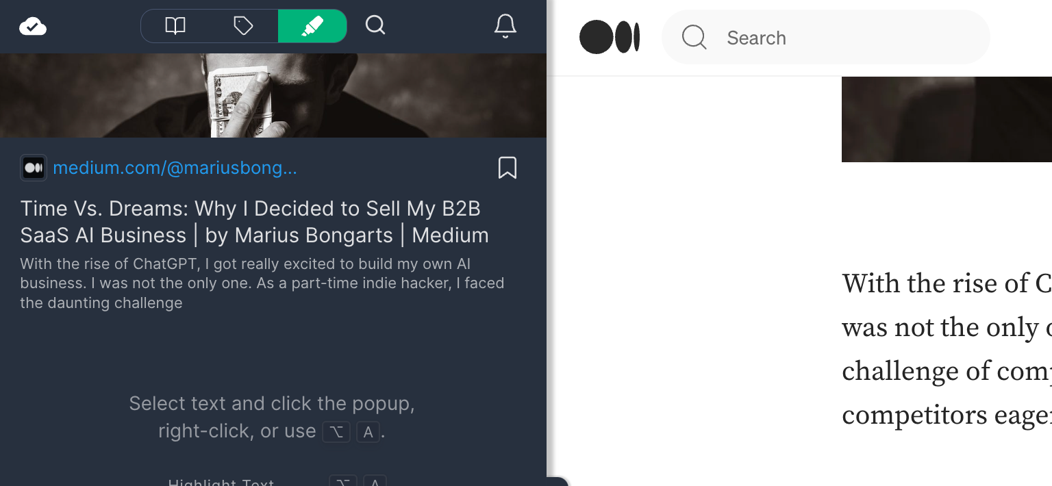
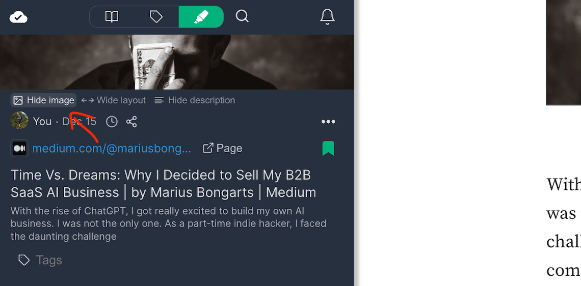
If the new cover image isn't your thing or you just want to concentrate on emphasizing text without any visual distractions, you have the option to hide the image.
To do this, hover your mouse below the image and click 'Hide image.'
Once done, the image won't be visible on this specific website you're highlighting.
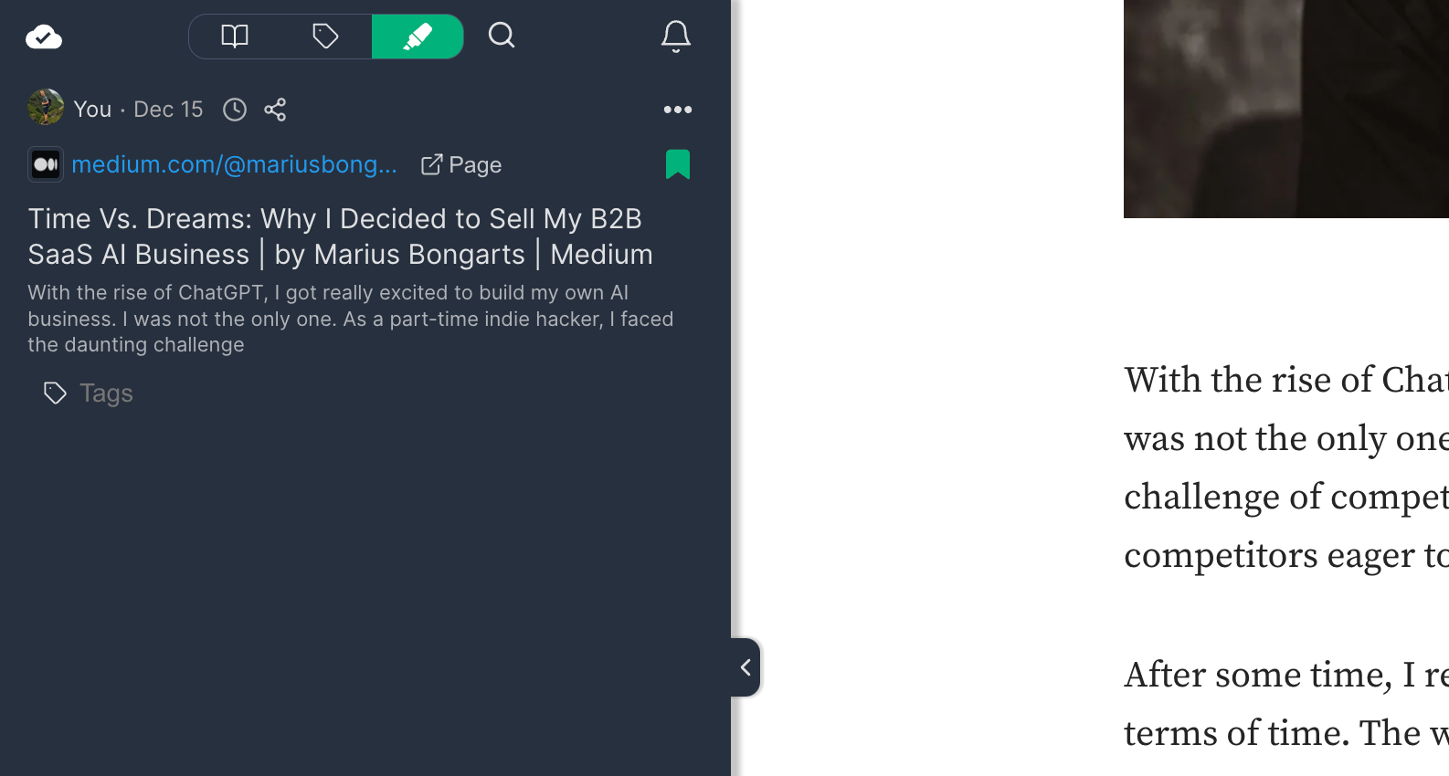
If you change your mind and want to display the image again, simply click 'Add image.'
Light ☀️ and Dark 🔦 mode
Previously, Web Highlights was exclusively in a dark design, which remains the default setting.
Now, there's an option to switch to a light mode.

Just click the sun icon at the bottom of the sidebar, and the sidebar will take on a new light color mode.
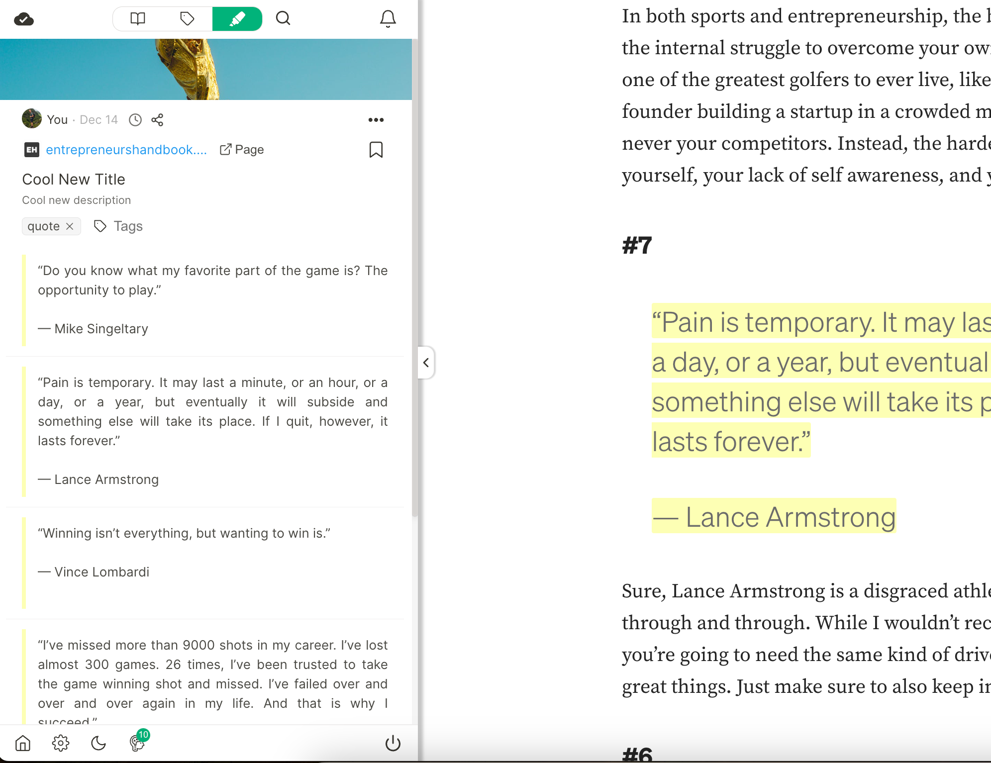
Feel free to choose your preference, and if you want to go back to dark mode, click the moon icon.
Edit Titles and Descriptions 📝
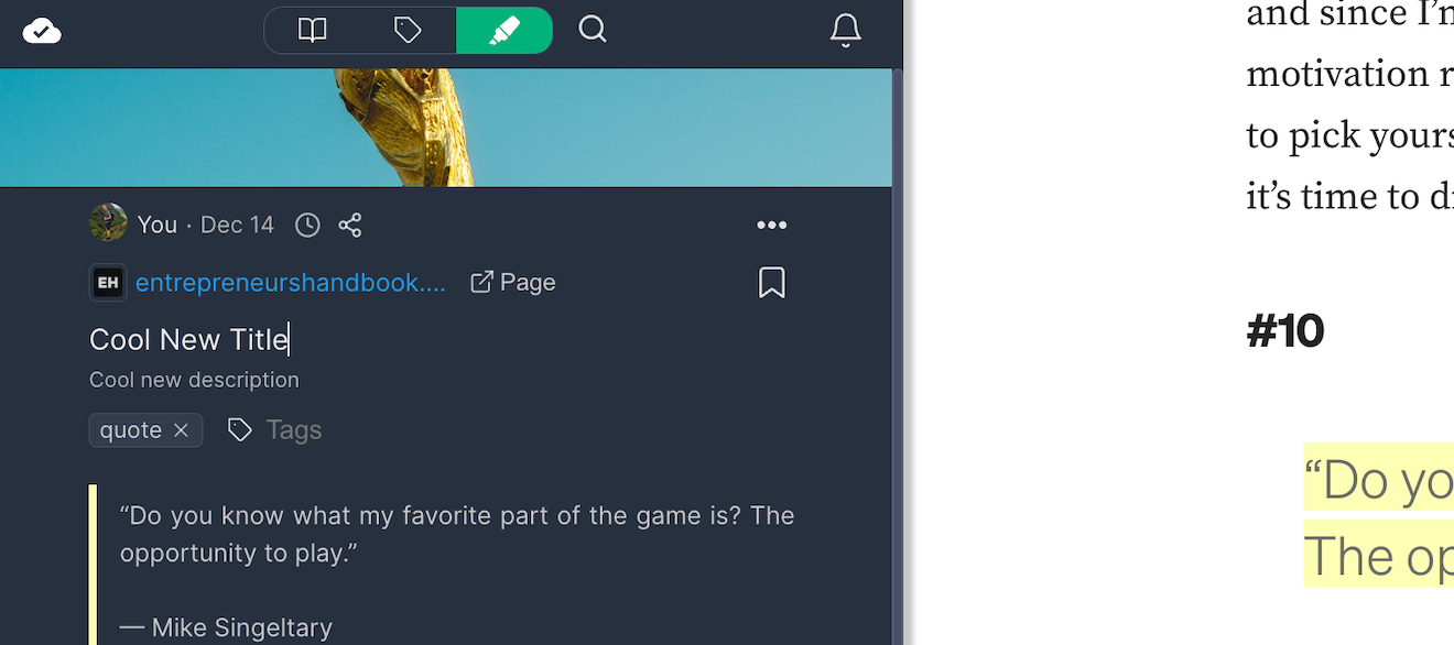
Previously, there was always a title in the sidebar that couldn't be edited. But now, things have changed for the better. You can not only edit the title but also add and edit a description for the website.
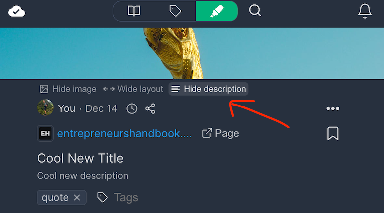
If you don't want a description, simply click 'Hide description' in the toolbar below the image to hide it.
Organized History List ⏱️
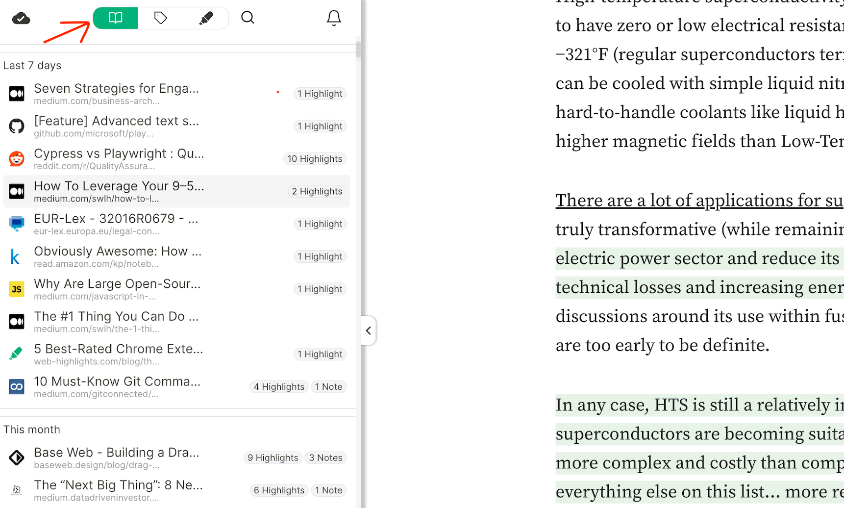
Previously, the leftmost tab view was somewhat disorganized, making it challenging to find what you were looking for.
Now, you have a neatly organized history list that displays the highlighted websites in chronological order, making it easier to find what you're looking for.
Popover Showing Website and Highlights ✨
If you click on an item in the history, a new popover will open up giving you a nice overview of all the highlights, tags, and notes of that specific page.
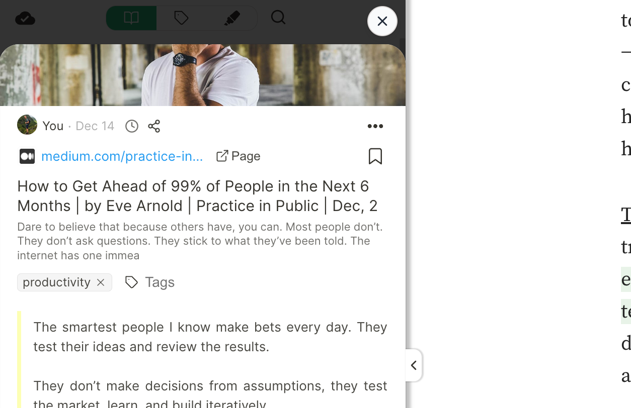
Open Websites as a Page ↗️
Maybe you already notice the new 'Page' button:
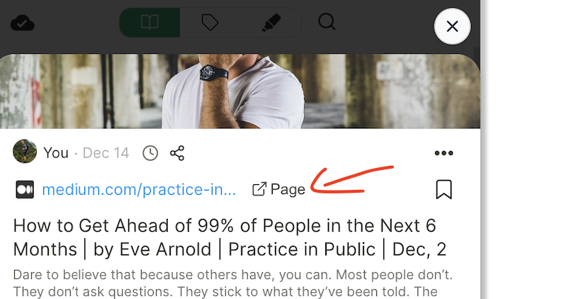
By clicking this button, the current website will open as a popup, providing you with more space to explore your highlights and notes.
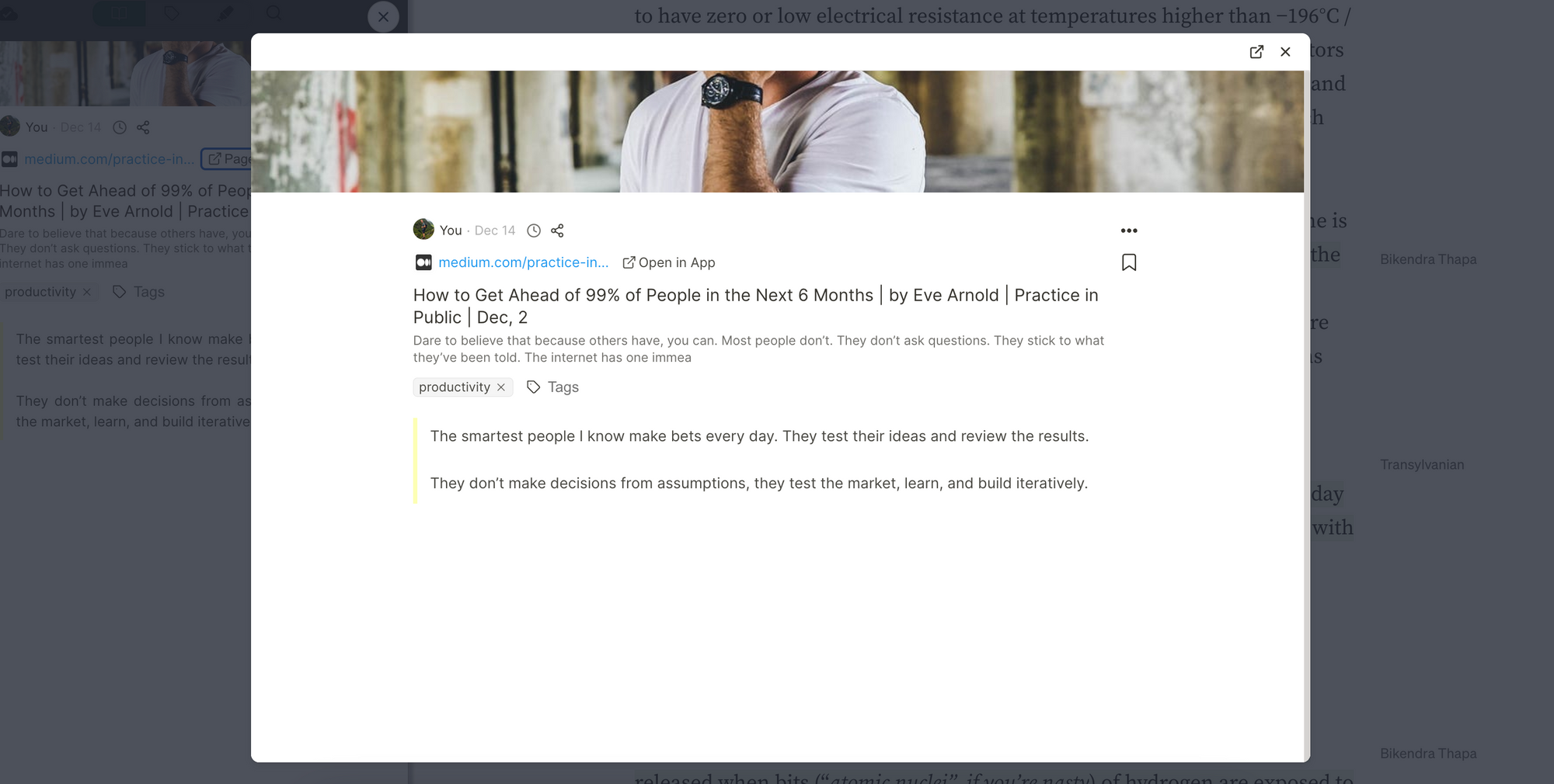
You could even get more space by clicking the '↔Wide layout' button.

That will adjust the view to the full width of the popup.
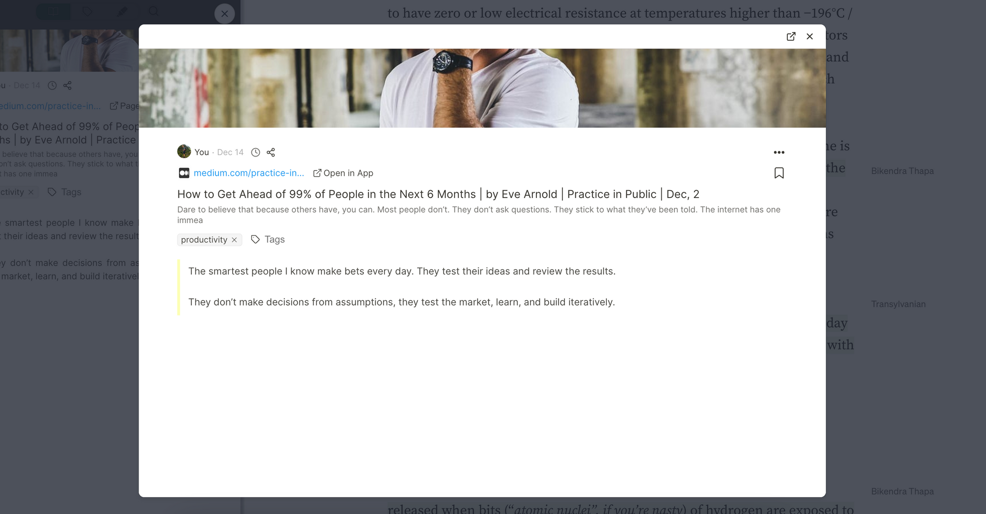
Furthermore, you can also click "Open in App" to open the highlight in the web app on web-highlights.com, in case you are using the premium cloud sync feature.
Organized Tags View 🏷️
Just like the history list, the tags view has been redesigned for a more organized format. Now, you'll discover a well-structured list of tags arranged alphabetically.
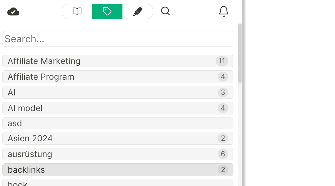
Moreover, when you click on a tag, just like before, all the results for that specific tag will be displayed. Additionally, related tags are now presented in a more organized manner.
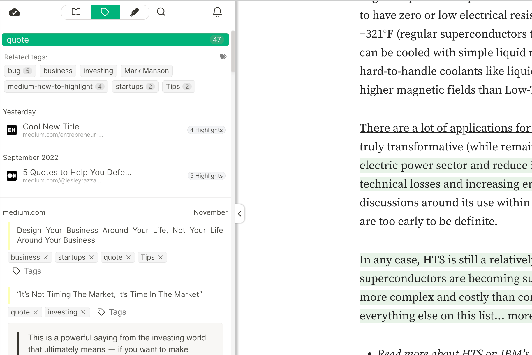
Similar to the history list, clicking on a result will open a popover showing the related website with all the highlights.
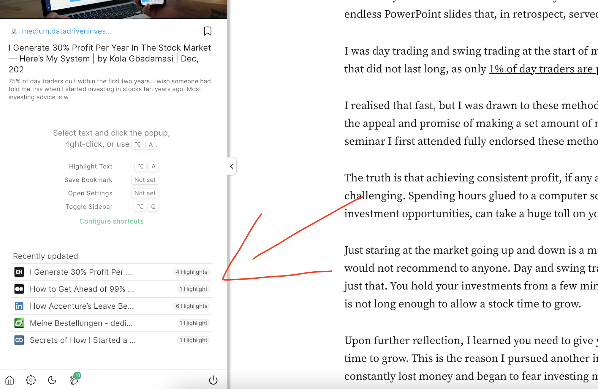
Quick Access to Recently Updated Websites ⭐️
Many times, we just want to pick up where we left off.
Now, it's simple with the new "Recently Updated" view in the sidebar, providing a handy overview of your most recent highlights.
Final Thoughts
I hope you like the new design 🙏🏻
Your feedback is invaluable to me, so please take a moment to fill out this form and help me enhance the app even more. I truly appreciate it!

